
TripWise
TripWise is a virtual traveling assistant that helps users plan for trips and stay informed.
Case Study | Passion Project | Design Research | Mobile Design
The COVID-19 pandemic has forever changed people’s mindset of leaving home: The fear of contacting the virus has made simple tasks like getting groceries to require more time waiting in line and effort in sanitization. Meanwhile, people are seeking ways to relax outdoors during the prolonged lockdown only to find out there are many who shared the same thought.
The goal of this project is to offer a reliable source of information for the public to plan and make necessary trips as well as staying up-to-date about the ongoing situation.
2 Month + 4 Weeks
Junyan Li - Mobile Design | User Research | Usability Testings
Adobe XD
Miro
Adobe Creative Suite
Survey Inquiries
User Interviews
Persona
System Mapping
Usability Testing
- Identify design opportunities from ordinary experiences
- Conducted the full user research -prototype design cycle through qualitative and quantitative methods
- Iterate upon existing prototypes using user testings feedbacks before finalizing design
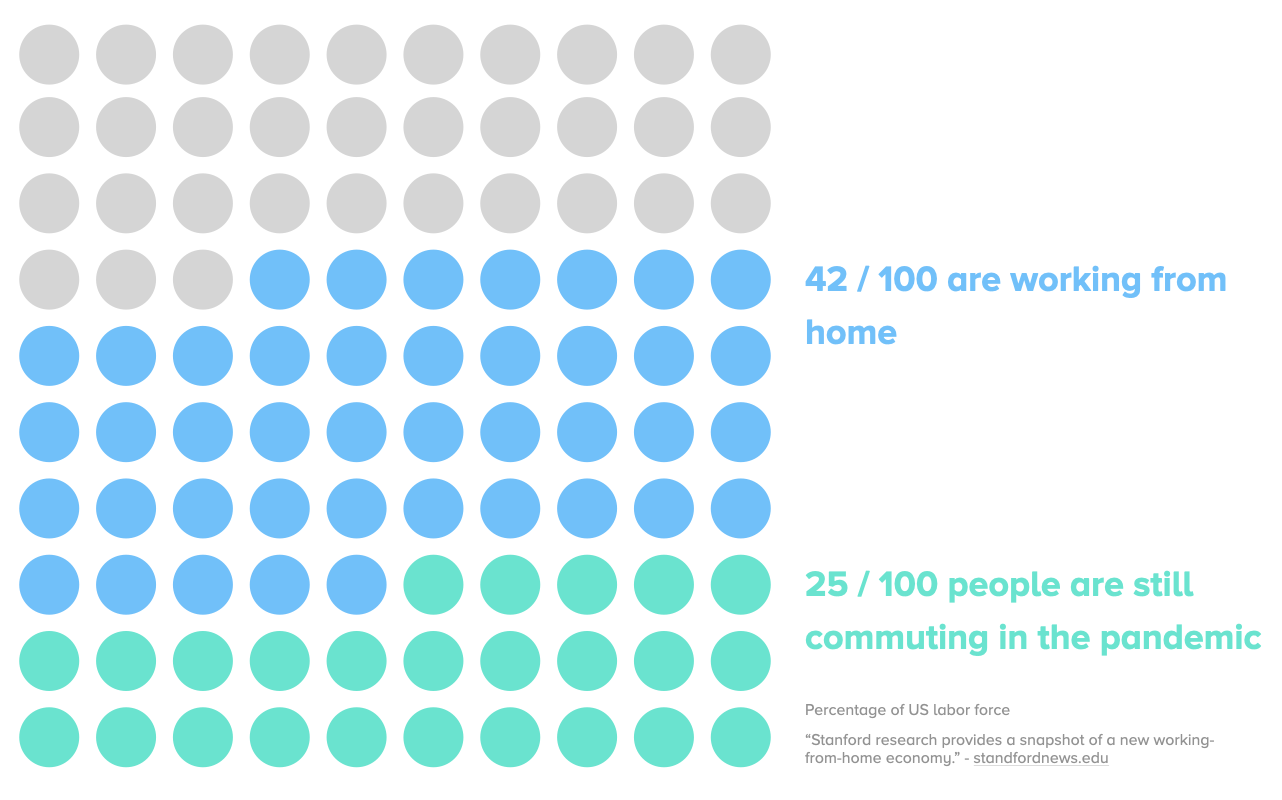
Not everyone have the option of working from home. A study by Stanford shows that about 1/4 out of 100 people still need to commute to their job, risking exposure and infection.
Meanwhile, being stuck at home for months is known to bring negative mental health effects on individuals. Which warrant the necessity of outdoor recreations.
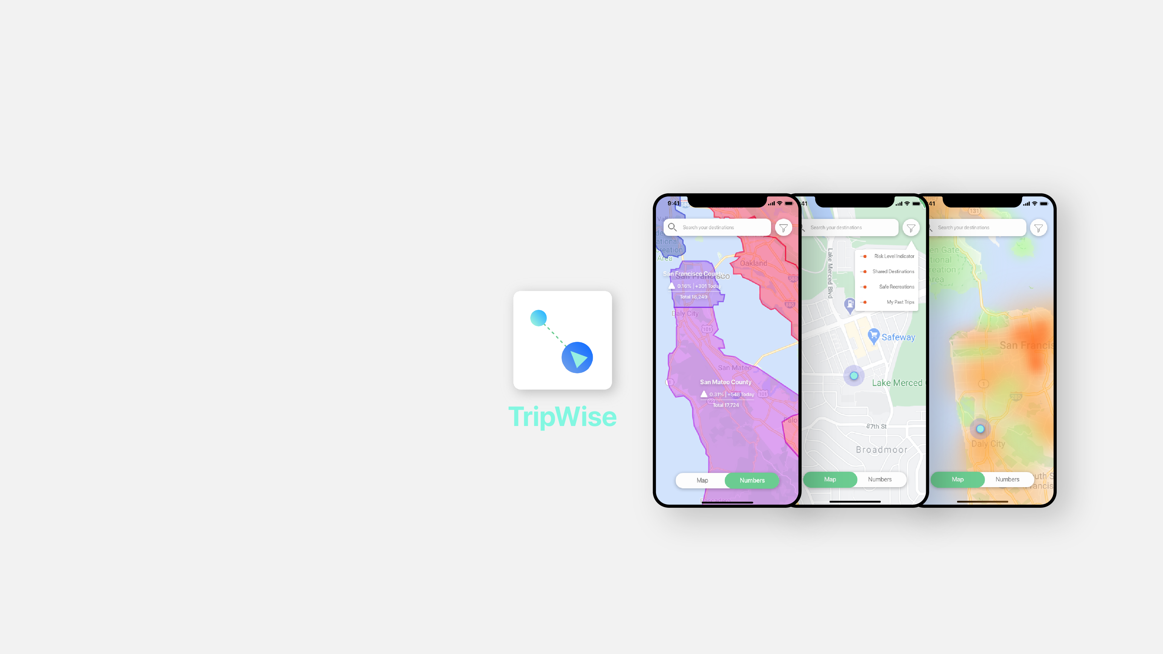
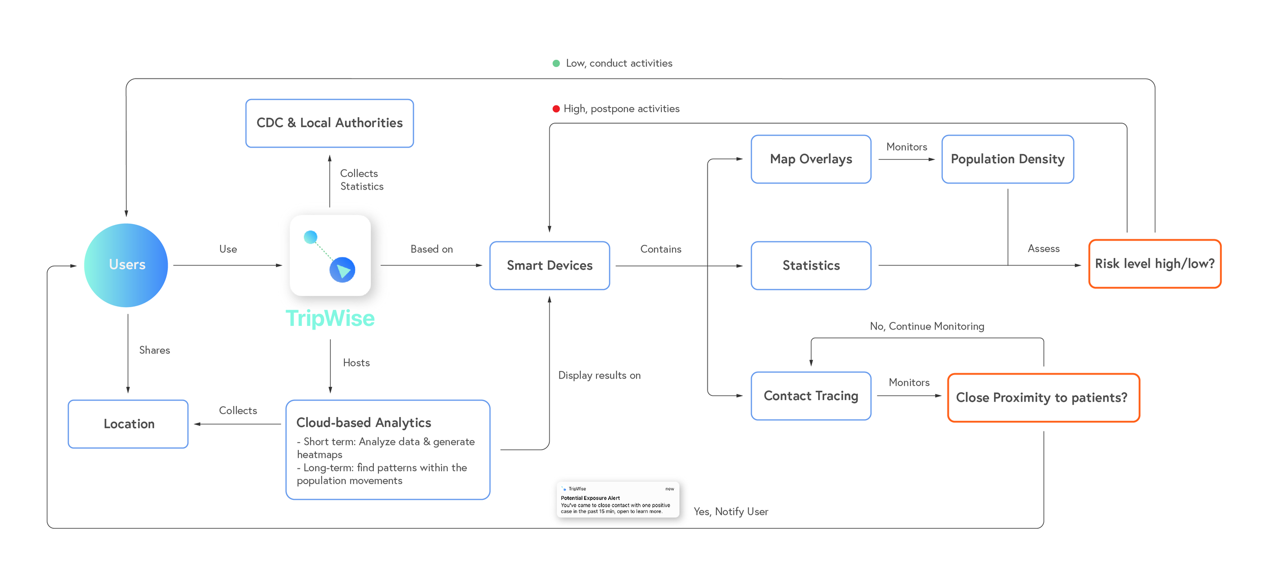
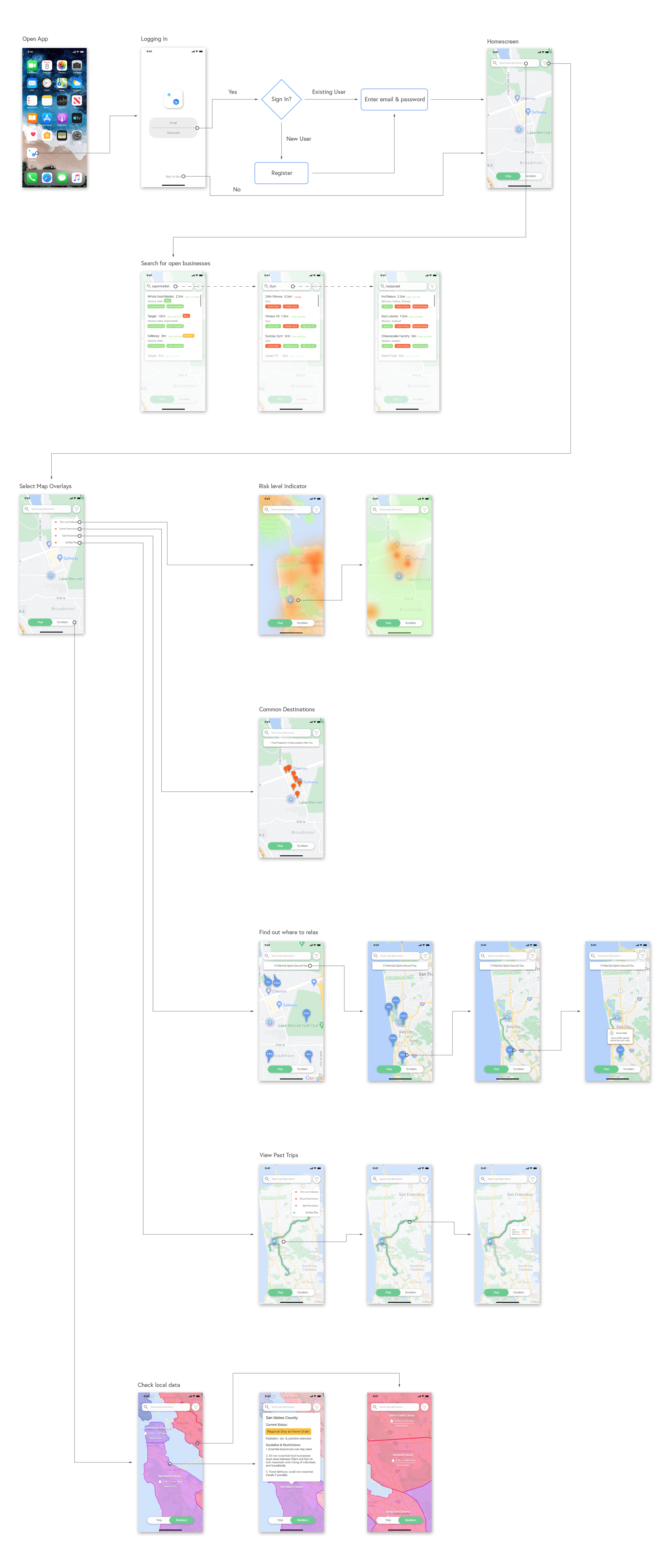
TripWise is a cloud-based map service that helps users plan for trips and stay informed.

TripWise will gather users' location data from an area through smart devices and use it to generate visualize maps overlays.

The most users within the network, the more accurate it will be in helping users make travel decisions.

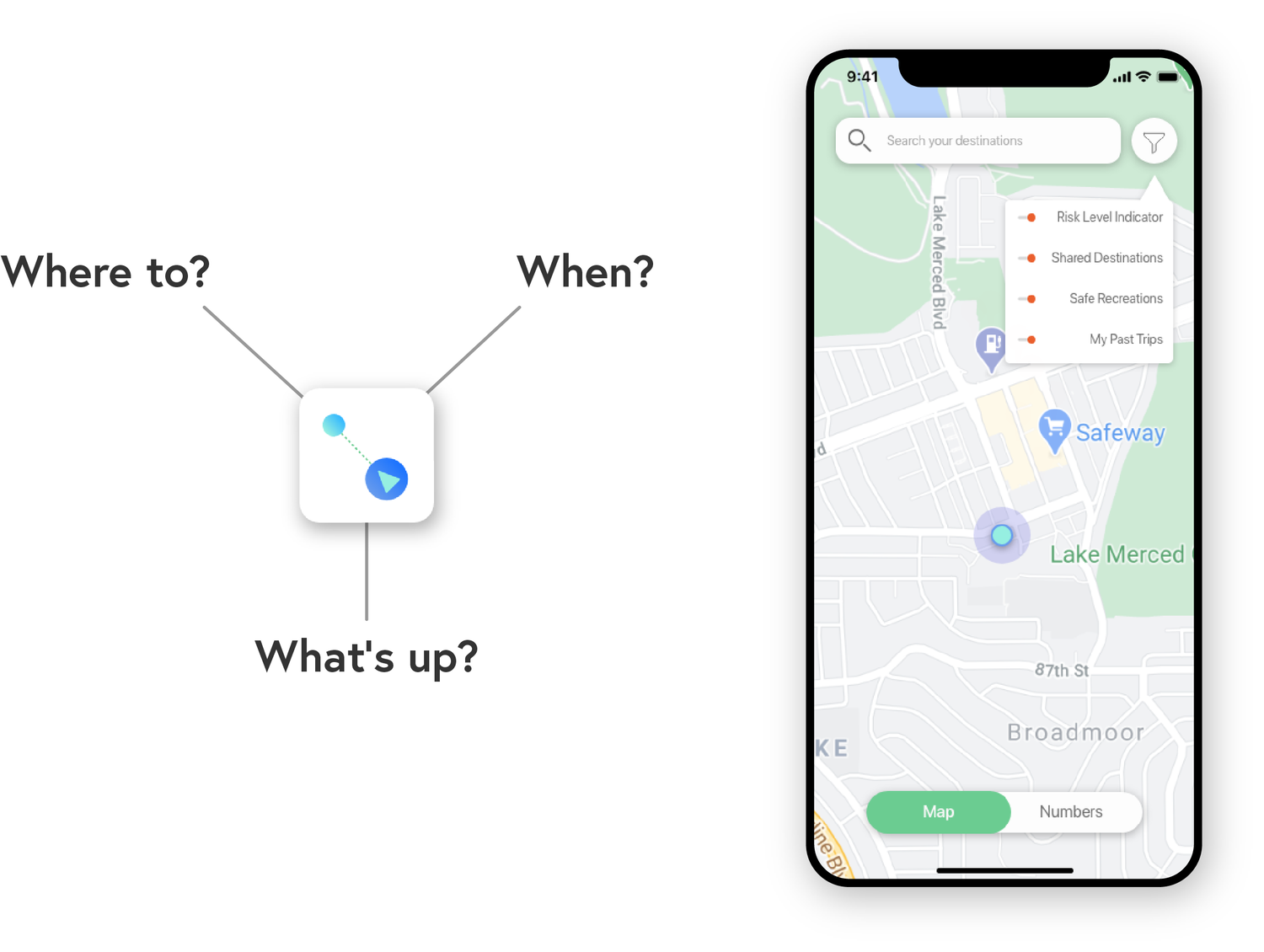
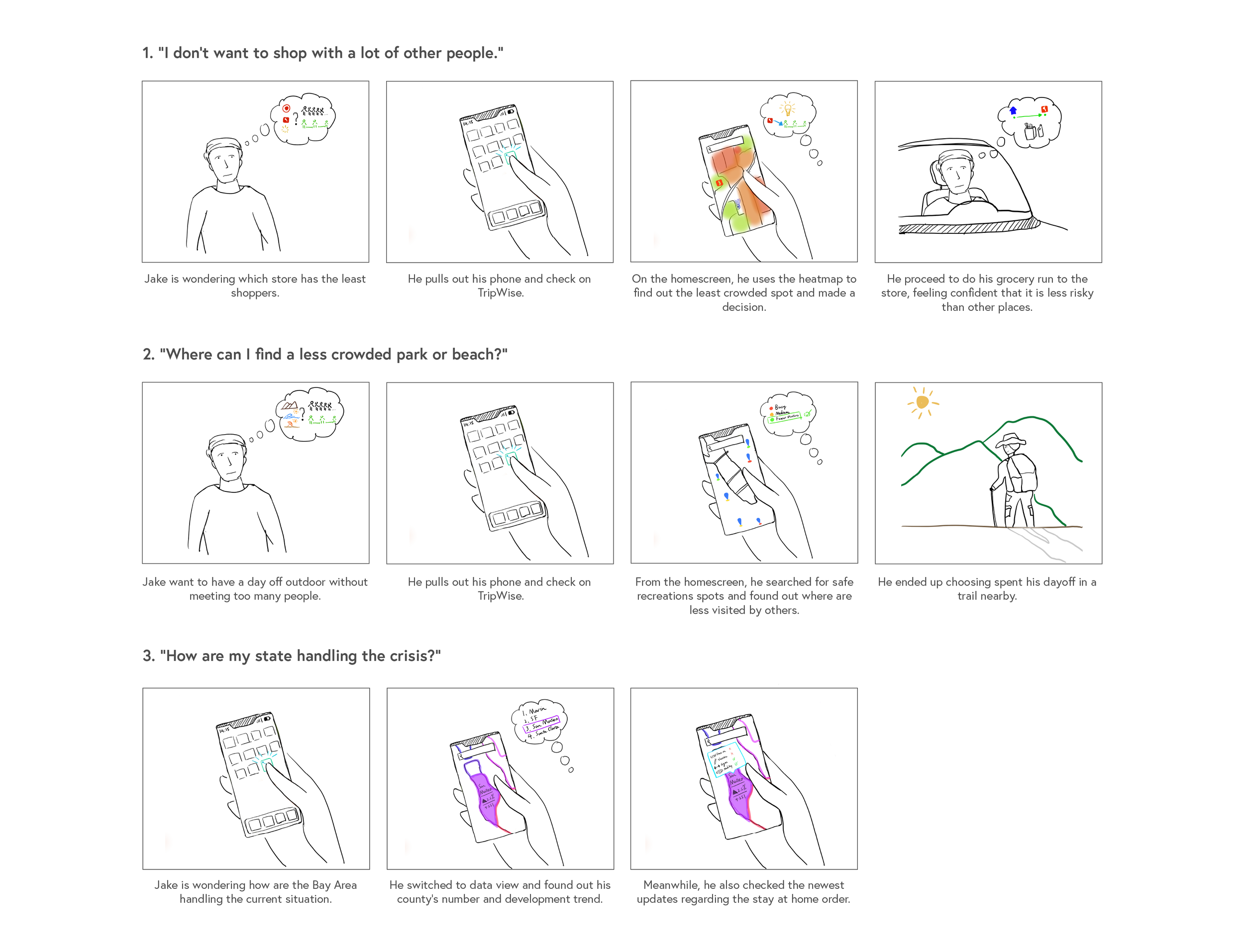
By turning data into various visual overlays on a map, TripWise will give the users a clear idea of whats going on around them.
With the help of risk level indicators and shared destinations, the users are able to see which location is packed in real-time.
Relaxation matters, so use the safe recreation filter to find nearby parks & trails with fewer visitors and have fun outdoor worry-free.
Find out what has changed since the last time you visited a local business. Staying up to date on their current practices and hours.
Color-coded map overlays provide a clear view of what’s happening throughout the counties, and the states.
You can also click on the specific county to get a better idea of the county’s response to the current situation. (e.g. Lockdown stage, business regulations, etc.)
Enabling contact tracing will give the platform the ability to alert you if you’ve been in close proximity to positive cases.
"This is an awesome App and I love how it visualize statistical data with colors"
"I can totally imagine myself using the heat map filter to decide when to go out to stores"
"I wonder if there can be a more subtle and blink-of-an-eye way to check my surroundings, that I don't need to open it up and look at the map"
"I want to know more about how can I manage my own status, test results, vaccines, etc."
Conclusion
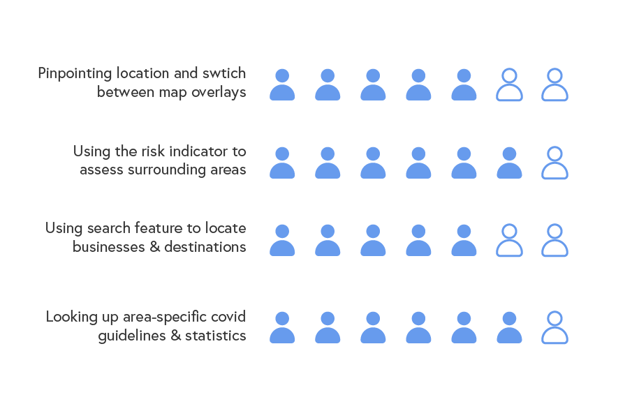
With the hope to launch the product on mobile in the future, I conducted 7 usability tests with my previous interviewees as well as new users with the final clickable prototype. The feedbacks are both interesting and helpful which helped me decide what to do for the next step. The results are:
1) Utilizing the map overlay features: 5 out of 7 users were able to locate themselves understand the goal of different overlays with in 15 seconds.
2) Risk Indicator Feature: 6 out of 7 users were able to use the risk indicator heat map to decide the population density around him/herself or their destinations.
3) Searching Nearby Locations: 5 out 7 users were able to use the search feature to look up businesses and/or locations.
4) Statistics and Local Guidelines: 6 out of 7 users found the feature to be helpful in keeping up with the changing situation.
"I went to IKEA expecting it to be less busy but it was PACKED, so I went full panic mode"
-- A Concerned Interviewee
The social distancing requirements have been implanted since the beginning of the pandemic. However, it is not always practiced in reality both due to personal choice, and limitation of space within a certain area.
As a result, community spread has become one of the major ways of infection for many who are unknowingly exposed to the virus.
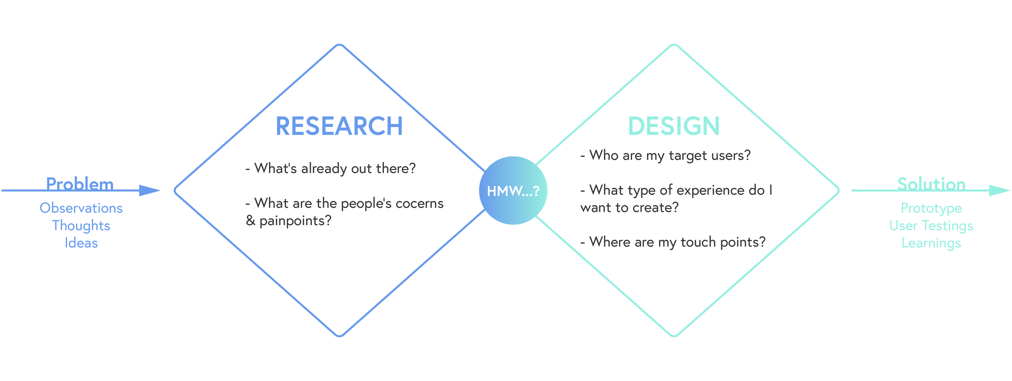
“So…what’s already out there and why did they choose that approach?”
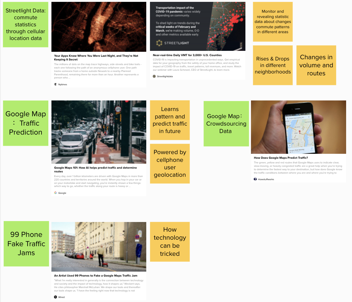
Google, along with other map apps has a long history of collecting their users’ location data and use it to estimate the traffic and traveling time. However, I found out that firms like Streetlight Data are able to gather and analyzing people’s travel patterns and display them through data visualization.
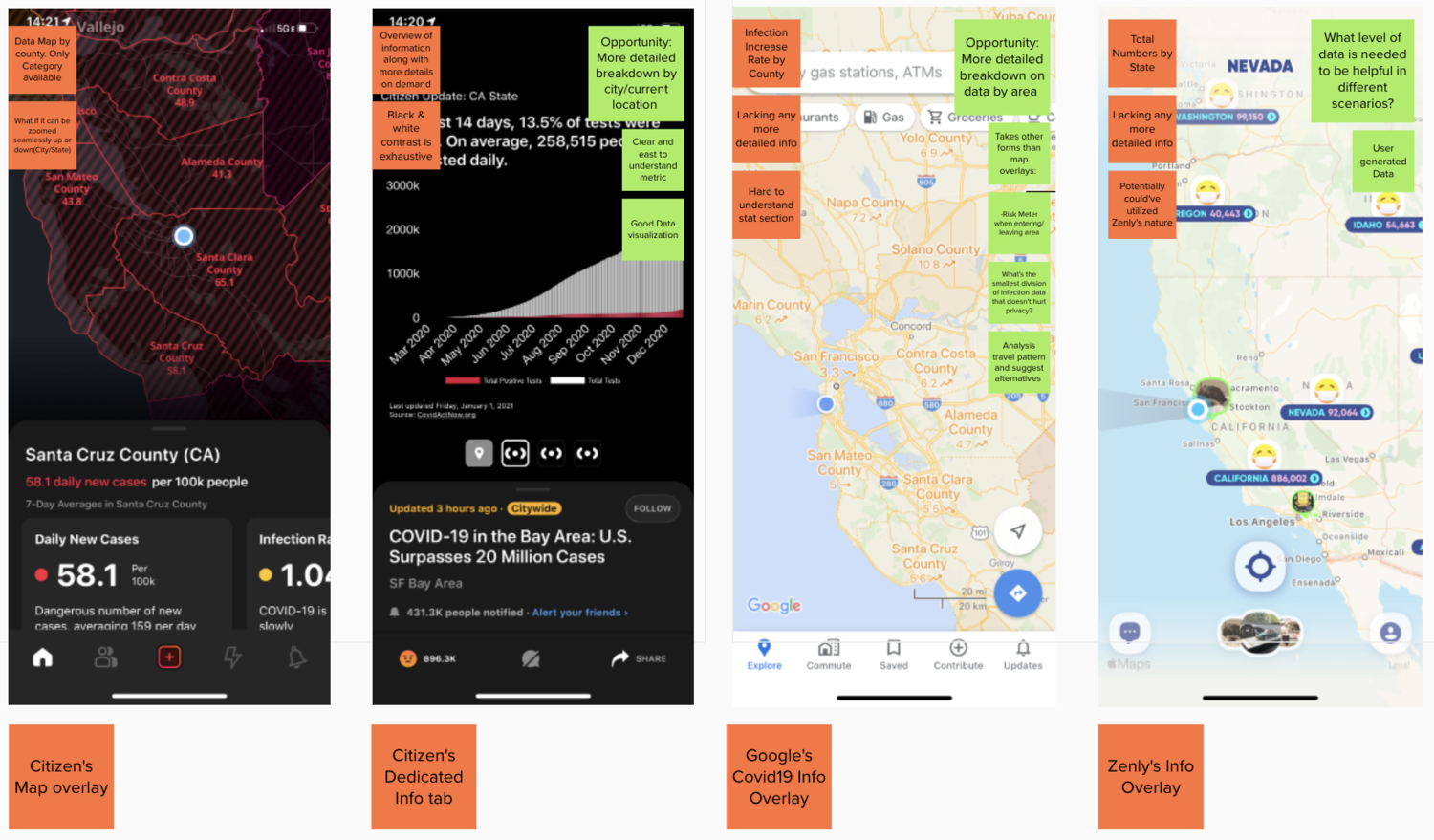
As a response to the situation, some map-based App companies have launched new features dedicated to showing the statistics about the pandemic across the country. I compared the pros & cons of 3 different approaches used by Google Map, Zenly, and Citizen.
- Technology is capable to support the gathering and analysis of all available locational data within an area.
- People are interested in staying up-to-date about what’s going on locally.
- Existing solutions' data visualization approaches are limited in terms of details.
“…And what are the users REALLY looking for?”
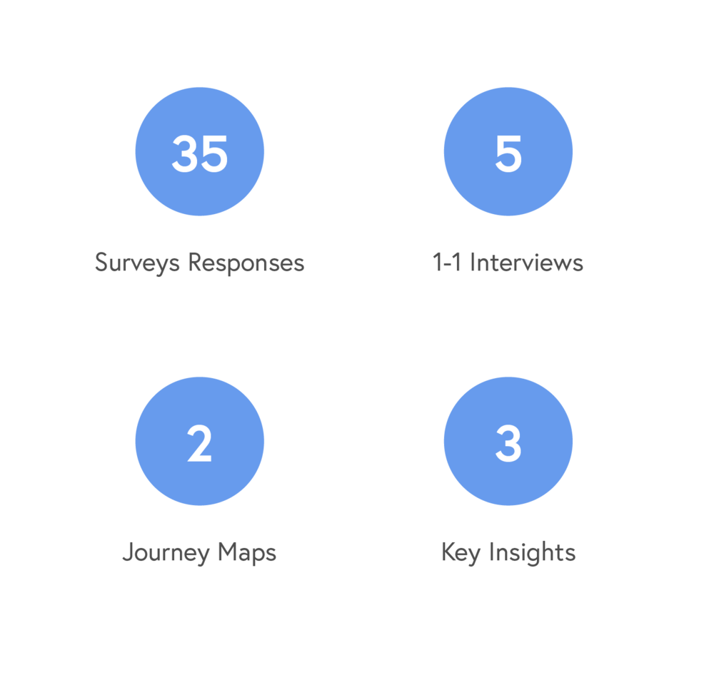
During the research, I was able to gather a multitude of data through surveys and interviews. This brought back some interesting learnings which contributed to the final insights that guided the design.
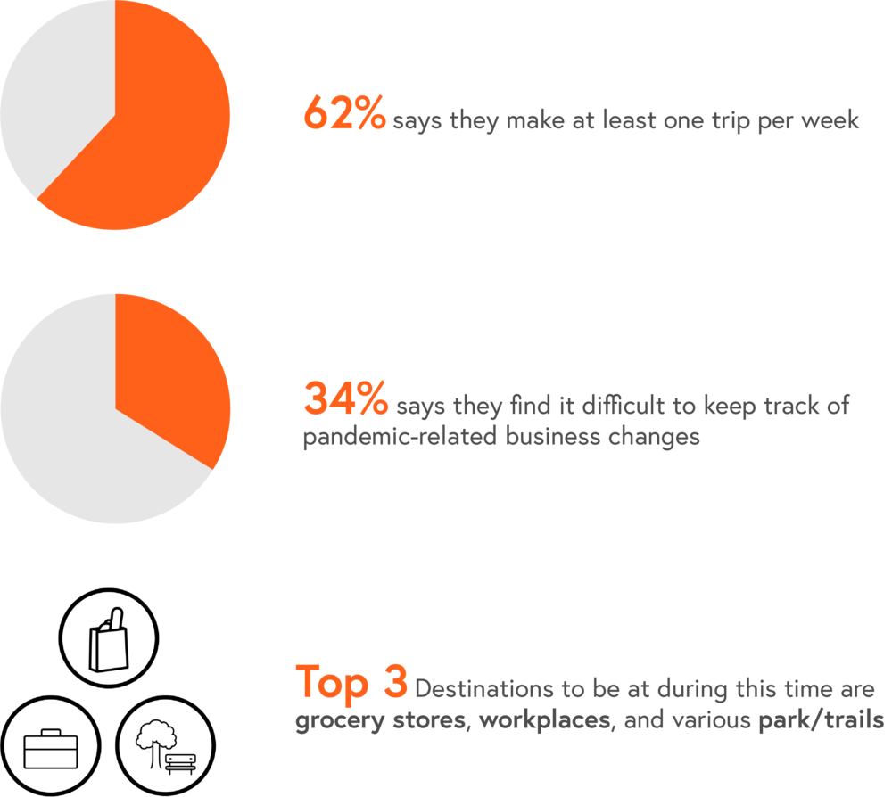
- Despite existing limitations, trips are still made out of necessity for many on a weekly basis.
- There’s a lack of more specific information regarding local businesses’ response to new regulations and/or requirements.
- There are still individuals still facing the risk of working in person.
I conducted one-on-one interviews with 5 individuals with different occupations, backgrounds and commute needs. My goal: To understand their approaches and experiences living with the Stay-at-Home Order since March.
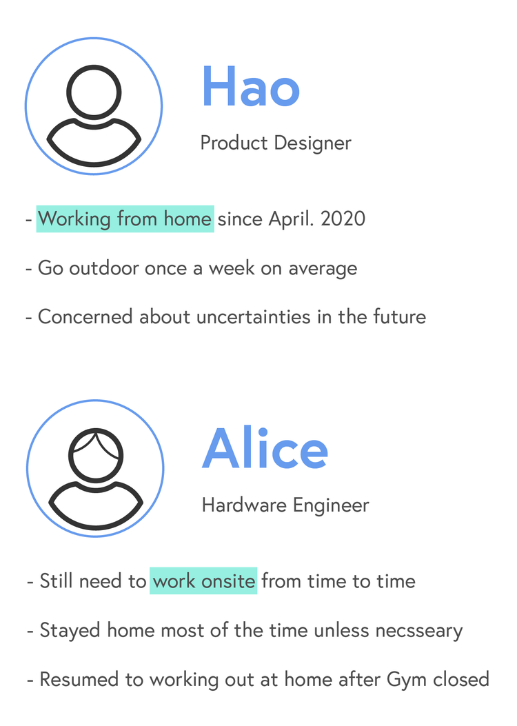
From the interviews, I learned there are two distinctively different journeys of a typical week from two working individuals: Working from home and working onsite.
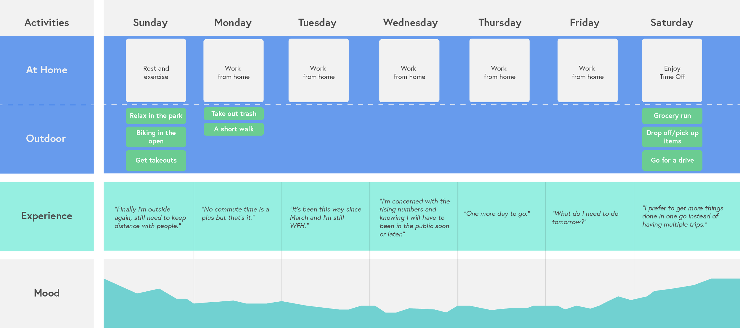
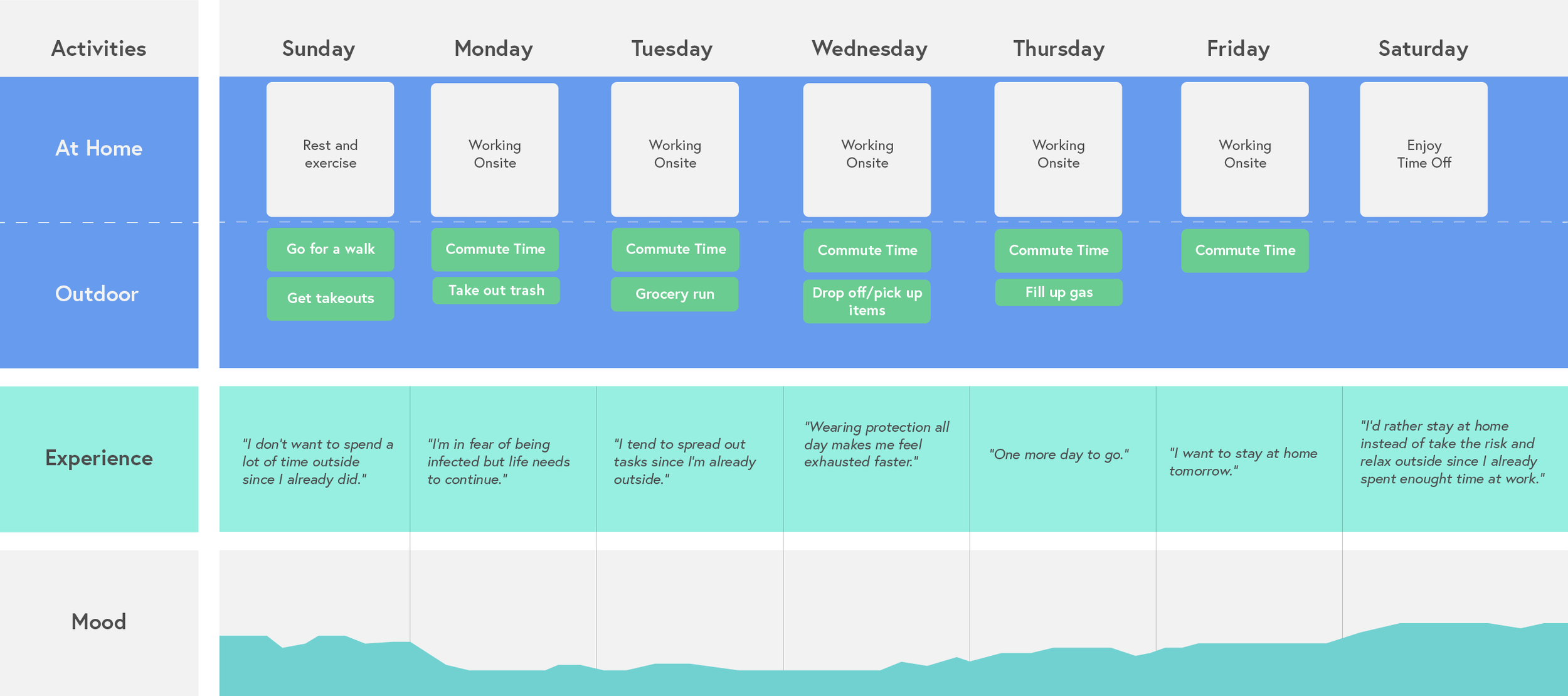
Based on the interview feedback, I journey mapped the experience of working from home vs. onsite in the span of one week. Recording activities and mood levels, I was able to visualize the difference in inexperience.
Working from Home: The long stay at home creates emotional low-spots and relief comes when there are chances to be outside.
Working Onsite: The fear of unknown risk is constant when there is a lack of easy access to information.
What’s in common: People share a tendency to concentrate tasks on one trip if possible.
“So…where are all these learnings leading to?”
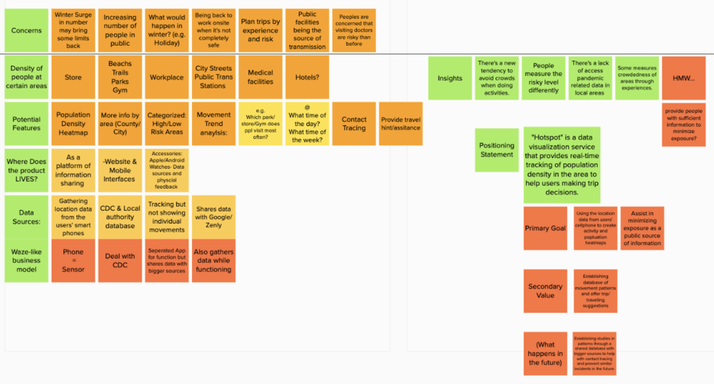
With the help of a designers' perpetual friend: post-it notes and card sorting, I was able to identify themes and patterns among the collective research data.
Multiple interviewees indicated that the data and new regulations floating online is difficult to access and keep track of.
"I'm cross referencing data from 1point3arces, the CDC, and Cali health department website to find out what's going on"
Staying at home for an extended period of time are creating negative mental health effects, which calls for intervention through outdoor recreations.
"containing the growing anxiety as the WFH continue is difficult yet necessary"
Those who are working onsite are facing the risk of infection yet have little ways to mitigate.
"I can't rely on everybody I encounter are practicing social distancing and taking precautions"
Many happens to shares the same thought when choosing where to go for outdoor relaxation trips.
"It's not rare occasion for me to finally decide to go for a walk in the trails and find out it is packed"
"The elephants in the room"
Many people's biggest concern is trusting those who are sharing the same space are healthy and taking necessary precautions.
As isolation at home continues and becomes frustrating, many seek escapes outdoor.
It is difficult to keep track of different sources of information with the ever-changing situation.
Ideation
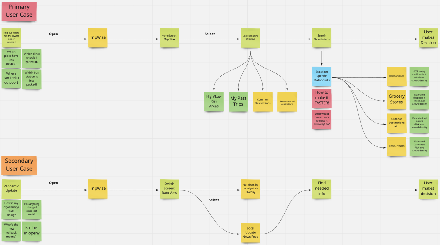
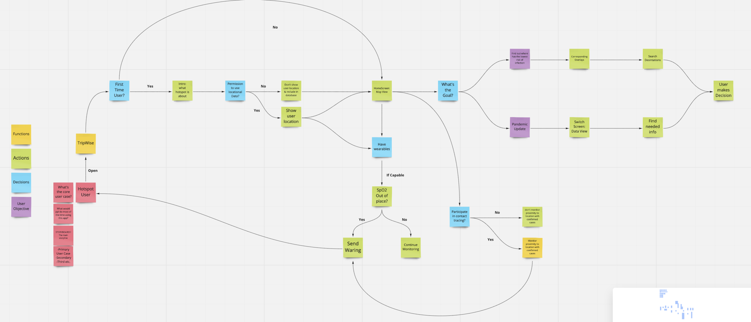
Based on the insights from research and the HMW question, I believe in a mobile solution would best suit my purpose; therefore, I started by building frameworks that will best represent the product's core & secondary userflows as well as the app's system architecture.
Based on the insights from the research, and after multiple rounds of ideation, I propose an easy-access model that utilizes the capability of modern day's location tracking technology to help individuals monitor the conditions of their neighborhoods, city, or state, and plan accordingly by making informed decisions.
As a part of the key assets, I created a userflow map to help paint a clear image of the mobile travel planner and it's key functions.
This is one of the independent projects I’ve worked on from scratch, the idea took shape from what I’ve seen learned during the first wave of reopening. Which I decided to leverage technology to provide assistance to those in need.
During this process, I learned to adapt and overcome - i.e. challenges that made in-person interviews impossible. Meanwhile, I still see more opportunities along the way, that I can hopefully continue to work on it and eventually bring it into implementation.
**Update 9.1.2021**
Google Map has updated its COVID-19 info overlay to include total total cases, death, and statistical trend sorted by county & state, very similar to the "Numbers" feature of my design. However, I still believe my design, being more detail-oriented and specialized, differentiate by providing in-depth insights and information to help users plan ahead.
My Takeaways:
1) Adapt in the Post-pandemic World: Scientists has speculated more than once, that COVID with be a part of our lives in the near future, which means many changes it brought to the society will most likely be semi-permanent. With that said, I see the value of a tool like this helping users make traveling decisions to avoid high risk area/time periods.
2) Wearable Devices Integration: Mobile App, being as widely adopted as it is, isn't the most efficient when it comes to providing lightweight & essential updates. Which is why as the immediate next step, I'm looking to add an apple watch prototype in the suite, to provide easy alternative for on-the-fly informational updates.
3) Contact Tracing Model: A double-edged sword due its controversies in assisting the public to stop the spread and potential when being abused. However, I believe there could be a middle ground - A detailed contact tracing model that address the privacy concerns by drawing the line between ethical and unethical utilization of users' data.