To build an onboarding experience that communicates and drives users for Tonebase, an online music learning platform. The goal is to guide the users to its core product values in their first moments inside the product. Utilizing available research learnings & resources.

The current flow starts with the landing page and ends with redirecting to the user dashboard. From my point of view, this flow by itself does not bear many opportunities to redesign.
Instead, I propose to expand the scope of “onboarding” into post-login, i.e. the Dashboard, where users are more likely to need assistance on and spend the majority of their time.

First, I sorted the content on the landing page into 3 themes: 1) Service Intro/Lesson Demo; 2) User Reviews; 3) Call to Join.
And the oddity quickly stood out, where different sections of the landing page have overlapping duties. It means the scroll is becoming unnecessarily long for prospective users.
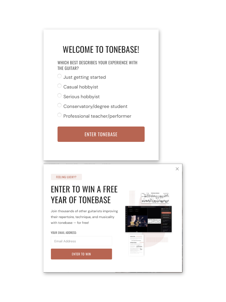
I love the idea of capturing the user persona as early as possible. However, the two pop ups (persona capture & email signup) are hindering the experience flow when the users are visiting the site to find out what it’s about as quick as possible.
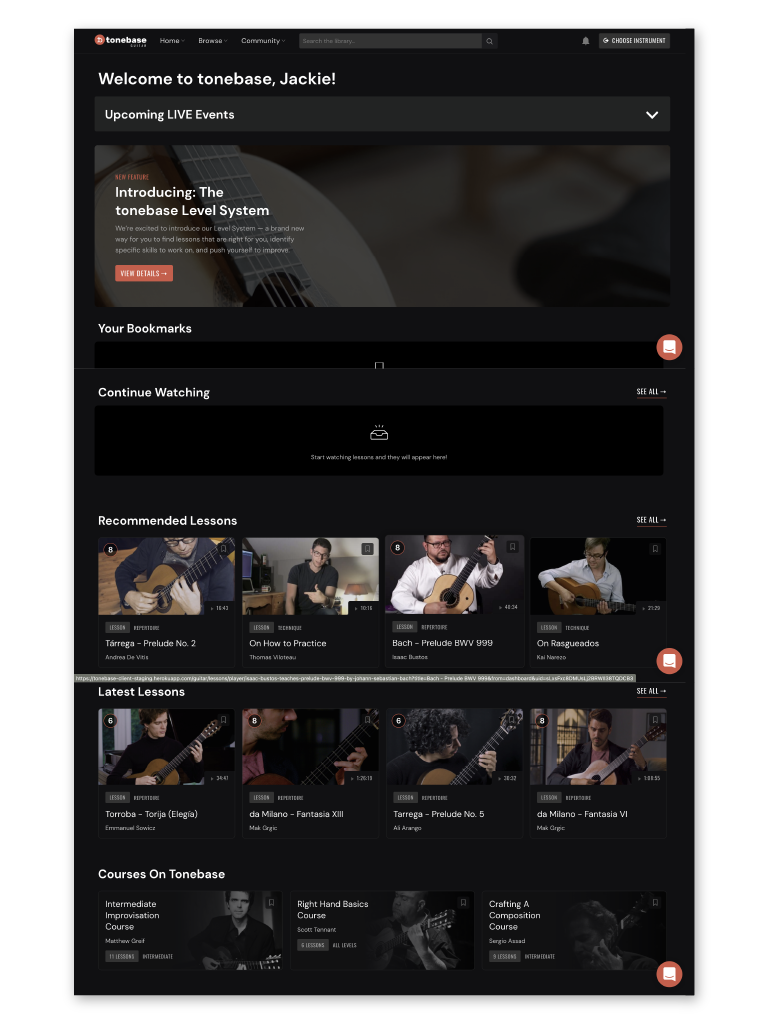
In the post-login experience, the first thing that caught my attention is the recommendations. I can’t help but wonder what are the recommendations based on.
Maybe there are ways to tailor video recommendations to the need of users with different experiences, skillsets, and preferences?
The Leveling system is a great idea as it provides quantifiable progress to the users. It also provided me an opportunity to think about ways to better integrate it into the current course library.
What if each video specifies the skills its teaching? What if the user is looking to work on a specific skill? How would the user keep track of his progress?
This is a good rapid mockup design practice and an interesting topic to tackle. Being a saxophone player myself, I have been through the exact cycle years ago, spending hours on the road going to classes.
I feel stoked to see how Tonebase is working on an online solution that matches the quality of in-person teaching. Given more time and opportunities, I would love to go even further into building an interactive teaching/learning experience on different platforms.