

GOdeals
Order-for-pickup cuisine marketplace, enjoy deliciousness for less.
Launched @ Feb. 2022
Product Design | Mobile App | System Design | Case Study | Design Research
GOdeals is an early stage, B2B2C startup, aiming to bring together customers and local businesses in today's neighborhoods by partnering with restaurants and sharing their exclusive dine-in and pick-up offerings to the customers on a mobile marketplace.
As the only Designer on the product team, I was deeply involved in not only the design process, but also in design research and working with the CEO & PM to define our business model, key userflows, core functions, identify service providers and being the primary point of contact with the engineering team.
6 Months
Founder/CEO | Product Manager (Engineering) | Front-end Developers | Back-end Developers
Figma
Adobe Creative Suite
Rapid Prototyping
Visual Design
UX Design
Usability Testing
- Helped to define the product’s core feature and user flows as well as its future roadmap through competitive analysis and customer research.
- Built & iterated low&hi-fi prototypes on Figma, while serving as the
primary point of contact with software developers.
- Defined key branding themes & assets alongside marketing and set the foundation for a comprehensive design system for future products.
This chart is a price comparison to order one meal from a local restaurant using 2 major delivery services (with and without memberships) and how much you would pay for carry-out. Paying nearly double for the same dish is insane, and for those who order deliveries frequently, the premium adds up quickly.

And so we deliver. By the end of the six-months period, we have completed the development of the Customer & Merchant-facing products, and released the App on iOS and Android.
For those who are looking for a cost-effective alternative to deliveries and don't mind a small detour.
GOdeals enables users to place remote orders and have the flexibility to enjoy whenever they prefer by partnering with your local restaurants and bring their menus right to your door with little extra cost.
Not only does it brings the menu to your finger tip. The additional ordering volume could also enable restaurants to run different promotions on your favorite dishes by reducing overall cost.
Got tired of the stacking delivery cost? Godeals presents an efficient and cost-effective alternative: Stopping by and pick it up on your way home, or save the code and redeem it in your next dine-in.
Cutting down the processing time with increased accuracy. When you arrive, simply pull up your order and show the QR code to the staff, they'll scan it and see the details right away.
Stay on top of your orders. Get notified when the merchant confirms your orders, when they are waiting on the counter for pick up, or when you just scored $10 off in a group buy.
For the business owners who are looking to grow their customer base and generate revenue that belongs to them.
The other side of the mirror. Our answer to the merchants' need for a tool that helps them run a business: Managing orders, updating the menu, starting a promotion campaign, and checking revenue.
A specially designed task flow for merchant users to keep track of all incoming orders. Confirm, prepare, ready for pick-up, rinse and repeat.
Nobody understand the menu better than those who created it in the first place. Therefore, we decided to let the merchants have at it with a fully customizable digital menu to accommodate for most situations.
Setting discounts and starting group-buy campaigns in the matter of minutes. The discount management features allows merchants to build loyal customer base, and improve retention rate.
The built-in financial management system enables business owners to view their revenue and make deposits to banks all in one place. Backed by industrial leading security measures.
GOdeals is also set out to introduce environmental friendly and sustainable practices to businesses to help them increase efficiency and reduce food wastes through end-of-the-day lucky boxes.
After months of user research, business discussions and design, I was able to validate the design before handing it off to the developing team. I did this by testing my clickable prototype with 10 users, 5 customers and 5 merchants. The results are generally positive but with space to improve in the next release:
For Customers:
1) Acceptance to the concept of remote ordering for pick-up or dine-in:
4 out of 5 users were positive of the idea of order ahead save for later.
2) Joining group-buys:
4 out of 5 users where able to place or join a group buy and check the result without any hints.
3) Navigating to desired restaurant and place an order:
5 out 5 users were able to place a mock order using the prototype.
4) Redeeming a Dine-in or Pick-up order:
4 out of 5 users were able to complete navigate to corresponding screen and show the order QR code.
For Merchants:
1) Acceptance to the concept of hosting group-buys with discounts:
4 out of 5 business users think this model is potentially profitable and would like to participate in future small-scale test operation.
2) Maneuvering around different functions from the home screen:
4 out of 5 users were able to quickly navigate to different features of the merchant App when given a task to perform (e.g. redeem orders, update order status, update menu item, etc.).
3) Setting up different menu items the business has to offer:
5 out of 5 users were able to figure out how to add/delete items from the menu; however, only 3 out of 5 users where able to find out how to add special deals(group buy & lucky box) to the menu without hints.
4) Checking available balance and depositing to a bank: 5 out of 5 users can complete the process without hints and fully understand the feature's purpose.
We will be measuring the impact of our product through the following metrics:
We spent the first 5 weeks conducting desk research and user research for both user groups: Customers & Merchants. There are two main objectives of our research:


We have witnessed the meal delivery industry's exponential growth throughout mid 2020 until now when many rather stay at home yet want to experience different cuisines the past two years.
With Doordash just went public, and UberEats continue the integration into the Uber ecosystem; companies are not only racing to capture more market shares, but also exploring new growth paths such as premium memberships, and grocery shopping.

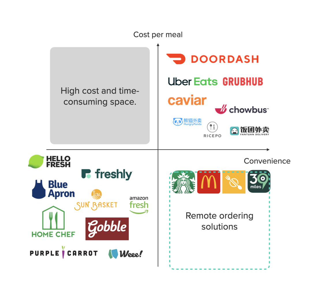
In the midst of the competitions within a saturated market, remote Ordering Service for dine-in and pick-up is a surprisingly open space to be explored.
Our opportunity lies in building a convenient and cost-effective alternative for both the customers who are looking to explore cuisines around them at a reasonable cost, and business owners looking to grow their business and generate more revenue.
Meanwhile, we saw great potential in introducing two business concepts into the food service industry: Group Buying and Mystery Box.

Group Buying has been around in the e-commerce world for a while, however, they are mainly used to sell non-perishable goods.
For us, it presents a perfect opportunity to be utilized by restaurants and grocery businesses, with better flexibility and timeliness in mind, to reach wider audiences by offering affordable products & services at a lower yet still profitable rate.

Mystery Box is an increasingly popular concept nowadays in the age of e-commerce and proven to be a good way to resale surplus merchandises.
In our case, knowing that surplus stock is also a thing for perishable goods, and often times, perfectly fine groceries are ended up thrown away. We want to build a channel and encourage businesses to sell their surplus inventory in the form of Surplus Surprise Boxes, in an effort to reduce food waste.
With a clear goal in mind, we moved into the desk desk research. Alongside the CEO & business, we gathered & digest the data from various business statistics to further identify the opportunity space. In the end, we were able to confirm the market gap's existence.

We turned to business magazines and statistics charts. As it turns out, aside from exponential growth of delivery services and meal-kits throughout the past 2 years, plus the already widespread contactless POS devices in the restaurant businesses, there is hardly any coverages in the world of service providers in remote ordering ordering solutions.
**according to Global News Wire, Expert Market Research, and Ask Wonder**
To find our ideal business space, we did a competitive analysis for the existing on-demand/fresh food market and identified an almost untouched space to be in: the remote ordering solutions space has very few competitors, and most of them are brand-specific, such as the Starbucks & McDonalds App.
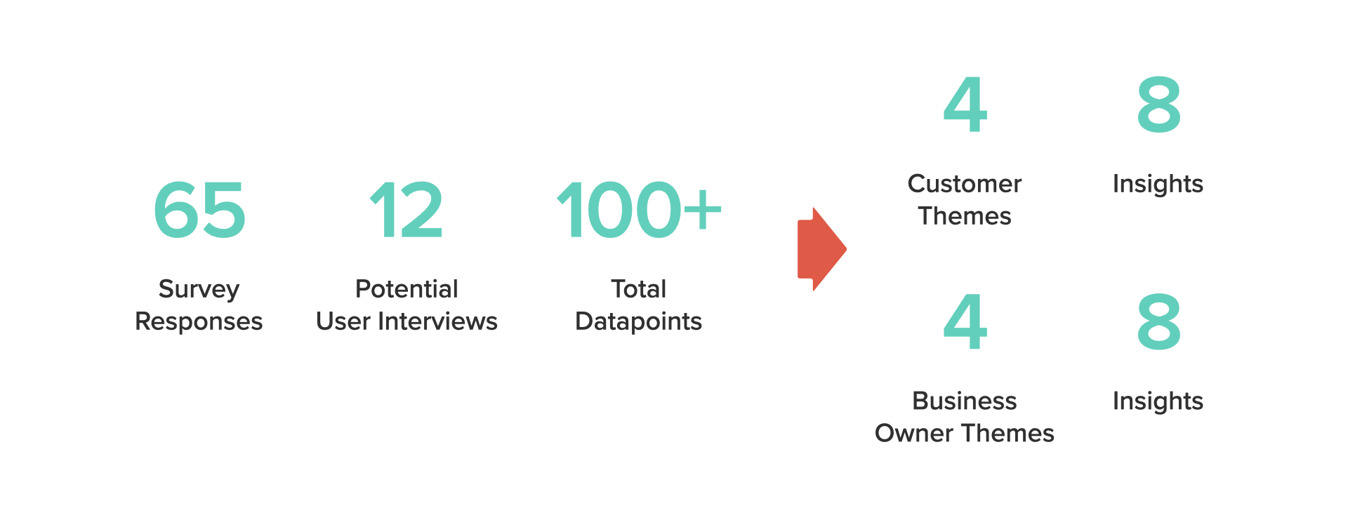
With the business scope hypothesis confirmed and out of the way, our next step is to understand our users' needs in their own words. We designed & distributed a survey to gather quantitative user feedbacks, reading app reviews of other delivery services. While I conducted further user interviews. With plenty user data and thoughts, I was able to paint a clear image from both perspective (customers & merchants) for the team.

Given the right conditions, many would choose to pickup mobile orders in order to reduce cost.
Preference over deliveries vs. pick up is more relevant to one’s schedule instead of the income.
One does not only choose to dine-in for its food, but also for the right space to hangout and socialize.
When in a dine-in environment, customers are more likely to try out new options.
Being present at a location in-person means way better representation for the business than it’s digital storefront.
Some users consider the pick up trip as an opportunity to explore other businesses in the Vicinity.
It is easier to form and adapt to a new routine with the right motivation.
A number of my interviewees started to use the pick-up feature out of curiosity and ended up loving it.

Many business owners are "diversifying" their digital order sources for increased resiliences towards various situations.
It is difficult for some restaurants to offer deliverable goods in a meaningful scale. For example, hot-pot.
Owners are concerned able the businesses' impression being solely represented by the carrier's performances.
Businesses are making effort to bring the dine-in crowd back to the environment they spent time and money building.
Businesses are adapting various 2B and 2C SaaS services in their daily operation at an increasing pace.
Remote ordering solutions are freeing up workers from traditional duties to participate in more diverse roles.
It is important to be mindful of the worker's bandwidth and not to overwhelm them with abundant tasks.
Design the process with efficiency and user-control in mind to reduce the need for customer support.
With the insights from both user groups on hand, I felt the need for a better, more personified representation for our potential customers and marketplace merchants. Therefore, I created these personas to help myself & the team a better idea during the latter brainstorm & design process.
Cyrene / 25 / Software Developer
Needs
Reduce monthly expenses on food while keep exploring the menus from different restaurants.
To take a breather away from screens.
Find more places worthwhile to “eat out” and hang out with friends.
Hong / 38 / Owner of Poco Noodle House
Needs
Increase profit margin & diversify revenue streams while staying within the existing staffs' bandwidth.
Attract more dine-in customer & more visitors in general to the carefully-curated physical location.
Manage the business's digital storefront: from processing orders, updating the menu, view & managing revenue, etc.
In addition to the design research, I also helped in finalizing our Business Model Canvas with the CEO & business. Since it is a crucial step as we move into the development process: To inform us key needs in both business operation & infrastructure for the product.

After reviewing the updated business model canvas, we moved on to dive deeper and identified a few critical things within our process: Project Timeline & Milestones, Short-term and Long-term Objectives.

Complete the product development & beta test before shifting into production environment.
Pre-operation preps: Marketing contracts, advertisements, promotion offerings, etc.
Onboard a first batch of 20-30 merchants and begin the 1 month trial operation.
Review the trial results and get ready for the full-scale launch.
Increase overall app usage (customers and merchant partners).
Expand service to more major cities and areas across the U.S.
Continue to improve different features of the App & internal tools in terms of UI/UX with feedback-driven design.
Build a efficient and competent, in-house engineering team to handle maintenance and future development needs.
After finalizing the objectives & timeline, it's finally time to get ready for some design work: I hosted 2 workshop sessions: first with the team, then with external stakeholders who expressed interests to our product.
We started from brainstorming core features & the draft information architecture, and discussed viable approaches to build them out. In the second session, I presented the results to the stakeholders and the feedbacks are positive in general, with a few new options to be considered.
The team collaborated with Miro for all the exercises, such as card sorting based on idea's viability and key userflows, and group working to come up with the Information Architecture map. We also did some quick sketching to get the idea through.
Using the basic userflows generated earlier, I sketched out a more comprehensive version on Figma and ran it through the team before diving into wireframing for the customer & merchant flows.
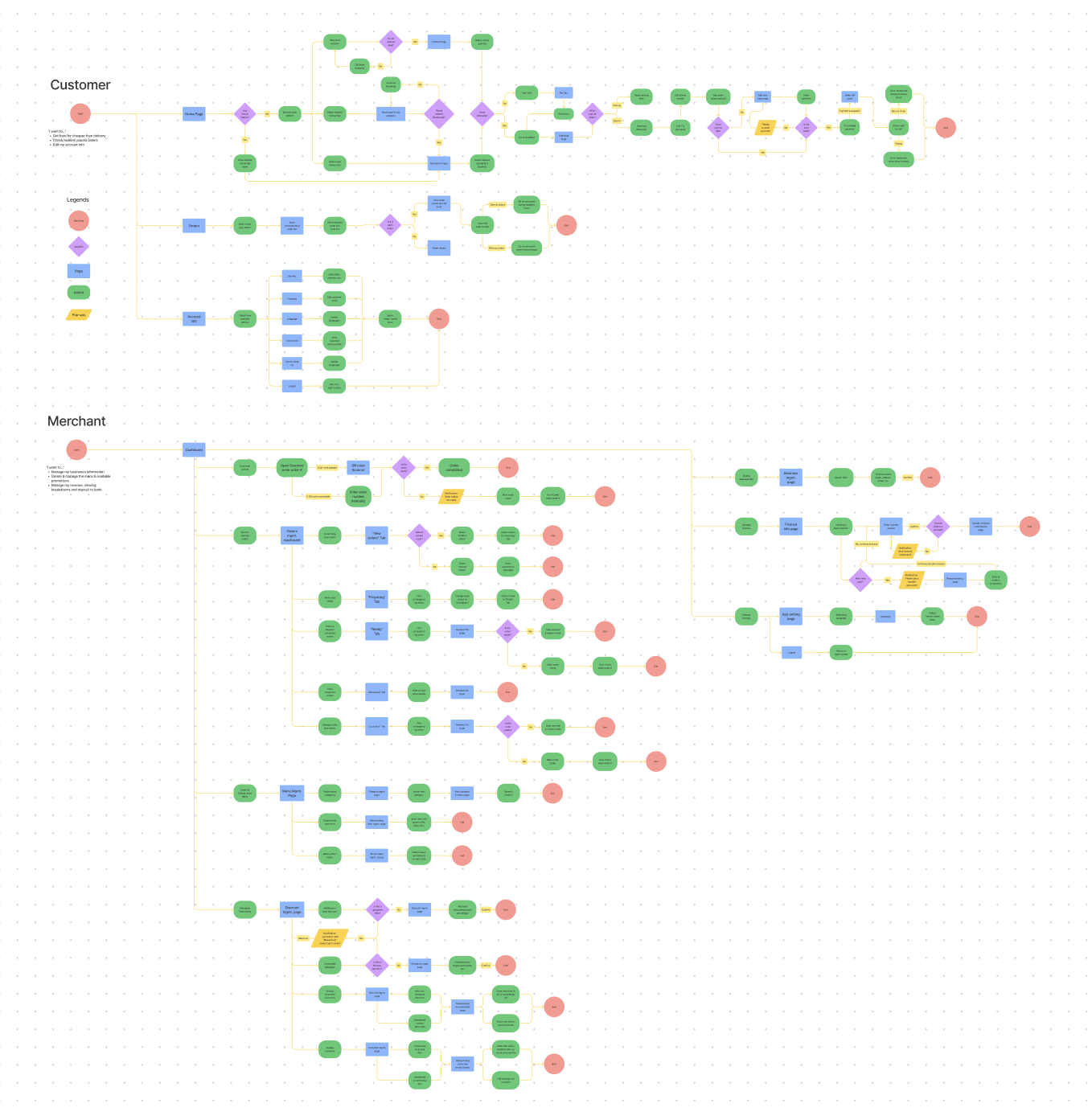
Knowing that there are two sets of design to complete on a tight schedule, I adapted the "divide and conquer" approach, and focused on building & polishing the customer-side experience, and use it to inform the design for the merchant side.
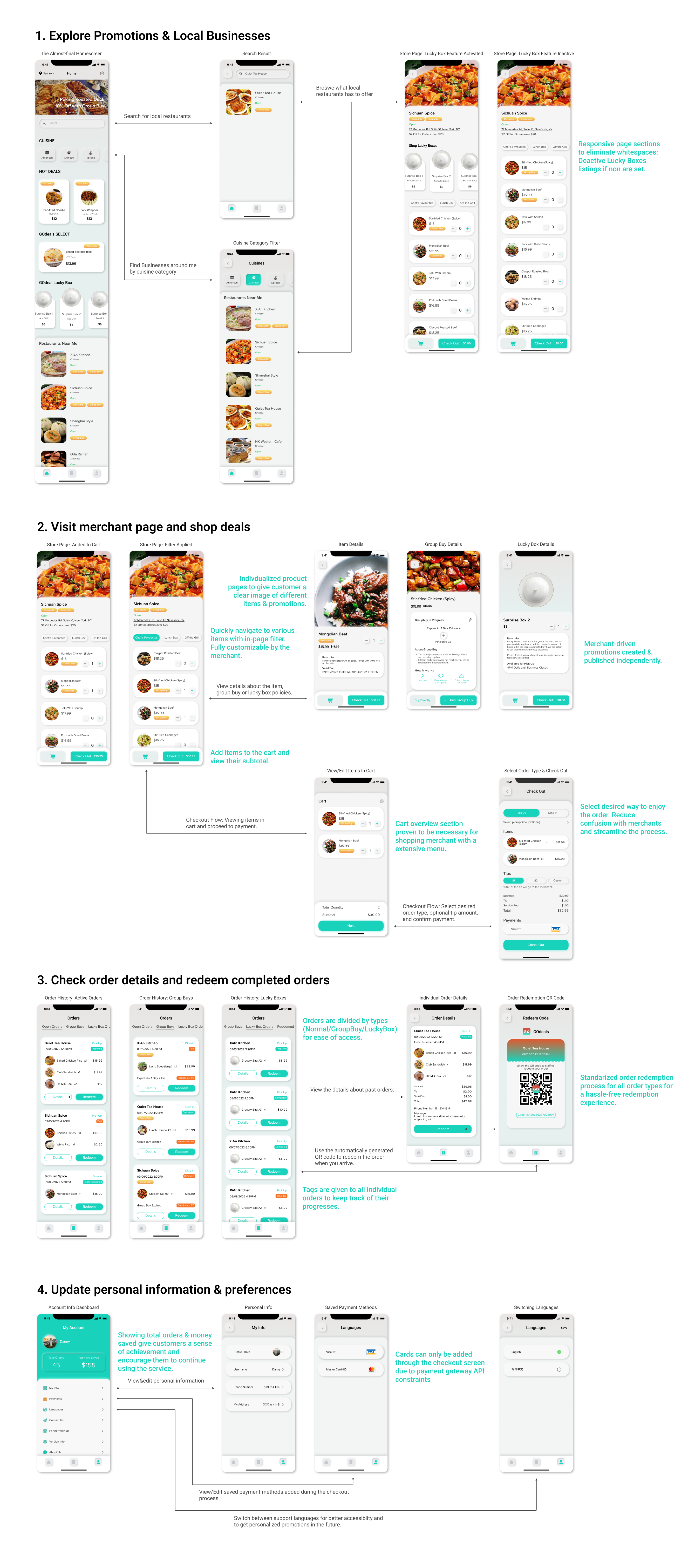
With a list of must-have features and user needs on hand, I proceeded to develop a low fidelity prototype to test out UI layouts and major userflows and get feedbacks from our potential users in terms of information structuring and finding logical loopholes.

Below are the almost-final screens(mapped to each major userflows) with changes made based on feedbacks I received while testing the prototype. Incorporating the learnings from the previous wireframes, I put the product through 2 more rounds of user testing before moving on the the merchant's flows.
In addition to the prototype, I have organized the components created throughout the process into a Figma design library for future use.
Designing for the merchant's needs in a mobile environment carries an entirely different set of requirements and core features to account for. For example, Luckily, the key features are already mapped out by the team and I get to invest my efforts on the prioritization of different user tasks based on frequencies.
I took a slightly different approach for the merchant's dashboard: I sketched out multiple home screen designs before branching out to different features and build the prototype. The reason being, I want to learn which layout can minimize the users' time spent & clicks taken in their routine task flows.
Once more, incorporating the feedbacks for the wireframes, I narrowed down the optimized home screen designs and step up the fidelity. Using the components from the library, I prototyped the product and did more user testings to validate the design.
Interestingly, a A/B testing revealed that some users actually prefer a more radical layout and workflow. However, I don't want to alter the design based on a relatively small sample size (which may not been ideal). Instead, I saved the concept for the future, when I can get feedback from a much larger user pool.
March 2022, the App was released on both iOS and Android. We are getting ready to scale the product in the next few months. For me, it is a perfect opportunity to gather feedbacks and data from a much wider user group to understand their needs & preferences. Such as:
What additional features or change to the current feature the users are calling for?
How much time does the merchant spent on each screen in their daily routine?
Did the user discover any loopholes?
Does the order volume reflects customers' preference to use us for pickup or dine-in orders? etc.
The list can go on and on, and I would love to revisit the design for some core features with newly discovered insights in the future.
I've worked on end-to-end designs in the past, however, this is the first time that I'm this involved in a product's creation: As the only designer in a small team, I have a say in the business decisions that ultimately allow the us to define the business model, before jumping into any product meetings that shapes the final App; I also worked closely with the developers to materialize testings feedbacks and understanding their needs and requests. For me, it is a valuable experience to have on my journey to become an all-around Product Designer. With that said, here are somethings that I have learned:
Documentation. Documentation! The entire product team are located across different timezones, 3 to 12 hours apart, and working with a distributed team is definitely an eye-opening experience. Besides the exposures to different work styles and work culture between the coasts and across the pacific, I also get to work on my documentation skills, which is essential for minimizing the guess work when the other party isn't available.
Build sympathy through design research. Living in a culturally diverse environment gave me the opportunity to try out different cuisines; on top of that, I get to learn the stories and struggles of many business owners through interviews and occasional small chats over the years. The more I learned about their experiences, the more I'm reminded that why I should be building products with positive user experience in mind.
User Experience does not stop at the product level. A product can be all optimized on its interfaces and userflows, however, if the business model itself contains debatable decisions in its practices, the user experience could still be crippled. In my opinion, it's important for designers to be thinking about products or features from a business context as well: What does the timeframe looks like? How would we prioritize as set of new features based on their complexity and/or impact, while leaving enough time for development and testing? Will an overcomplicated yet underdeveloped feature negatively impact the user's experience in the long term? One doesn't need to be in the leader's role to take these factors into consideration.